Benefit Leader Dashboard
Castlight Health was developing new products for Company Benefit Leaders. This tool will enable them to create and track campaigns to help employees get medical cost-effective treatments tailored to their needs and also reduce benefit costs for the company.

The product was brand new so I worked closely with the User Experience design team to translate business requirements and define hierarchy on the screen. From initial interviews, persona's definition and overall user research, the team got an understanding and the user experience designer created the information architecture and initial wireframes.
My role was to lead the visual design aspect for this new product.
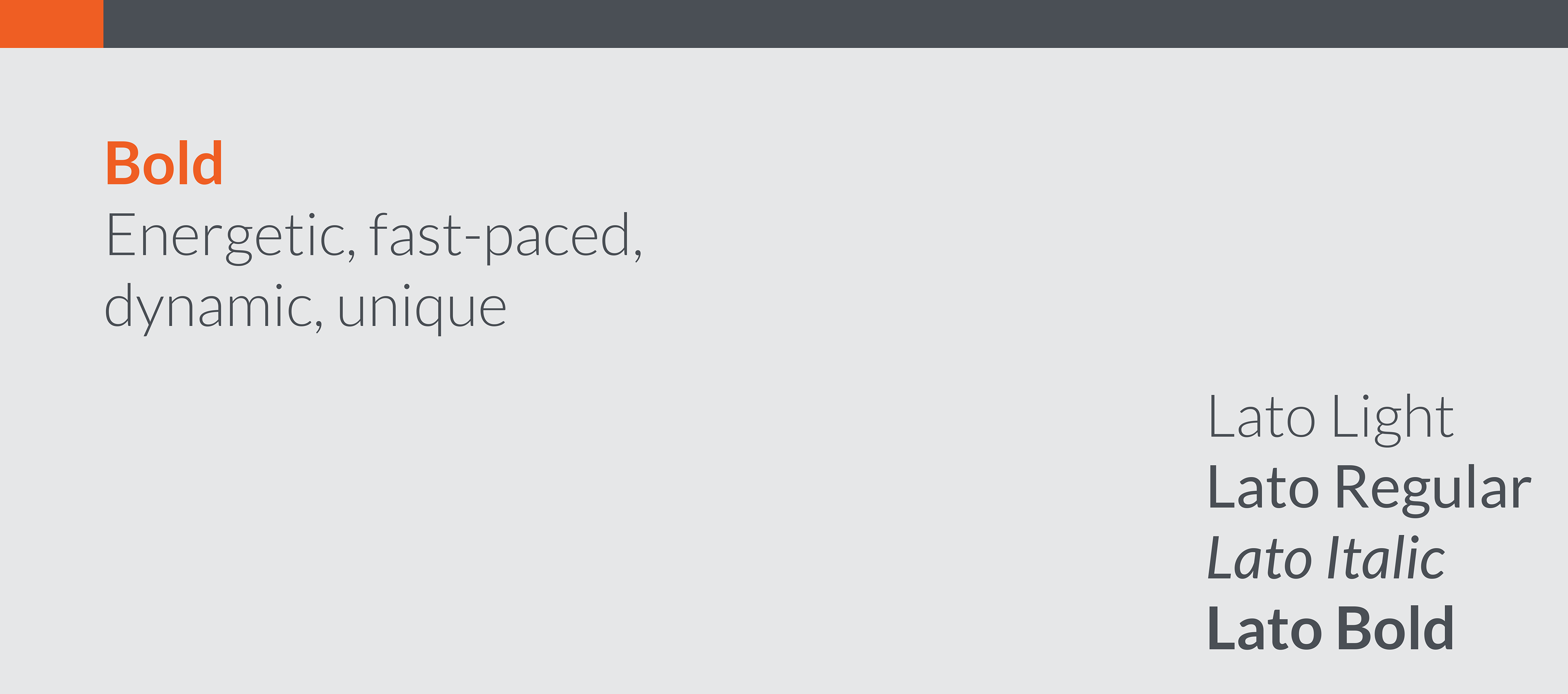
From the initial stage wireframes and persona's definition I created a series of mood boards describing the characteristics of the different Benefit Leaders. Their ages ranged from 25-45 years old and the audience was a mix of male and female.
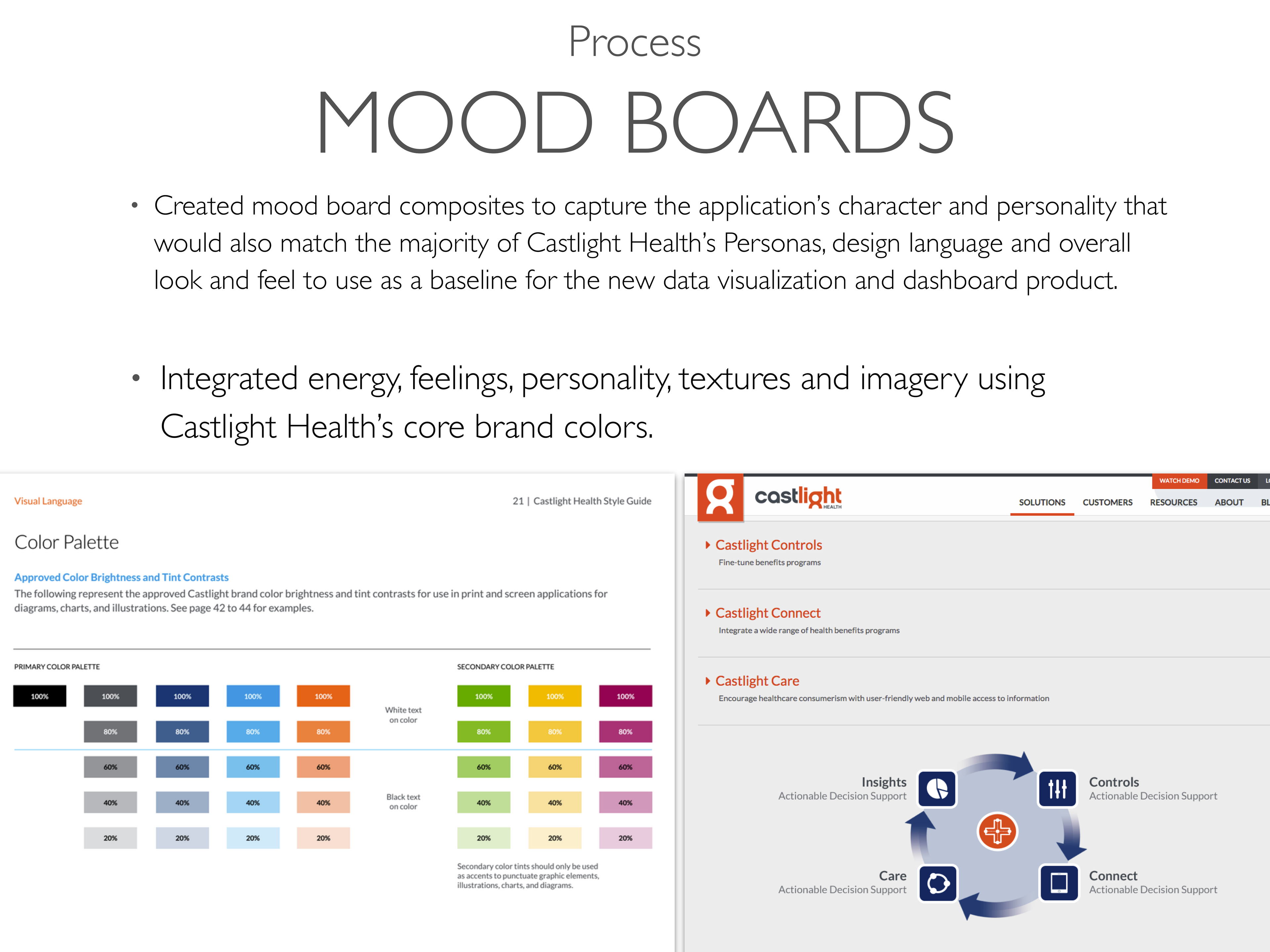
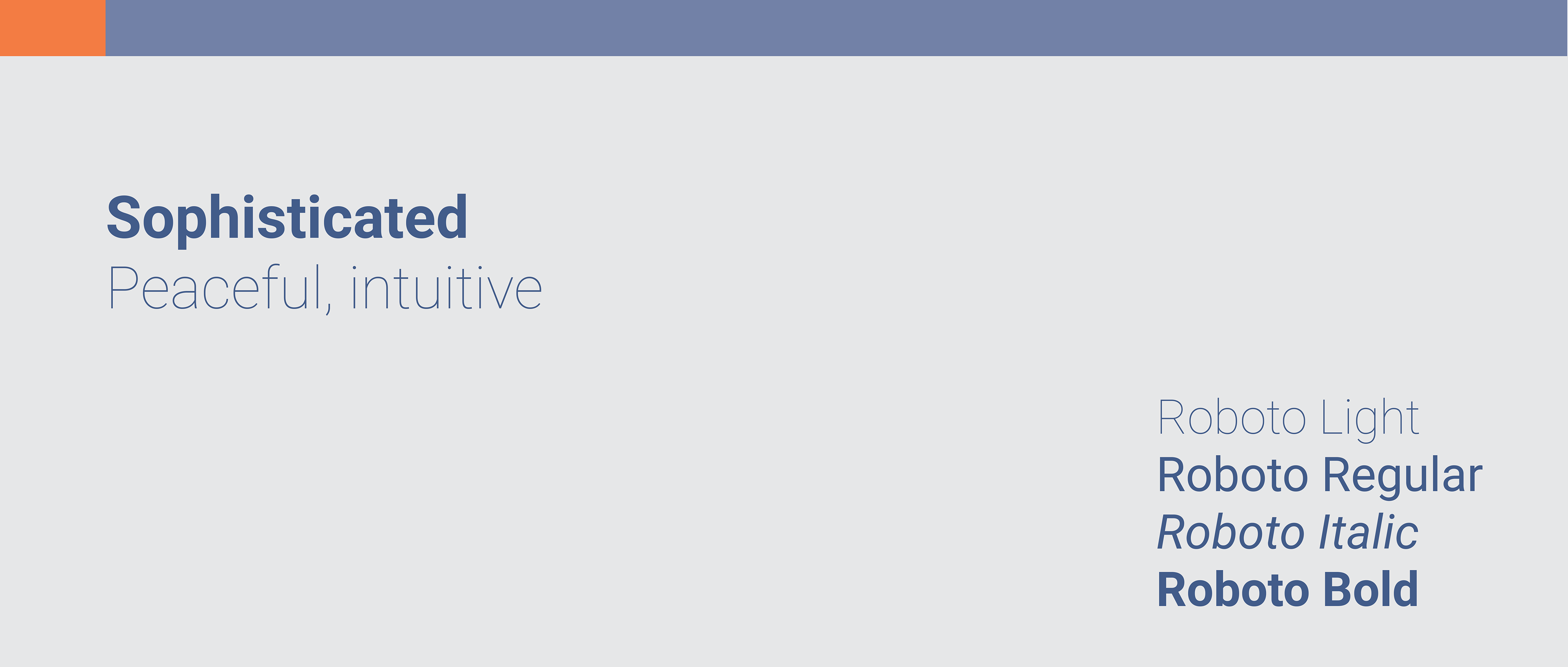

In each mood board I captured with the use of Castlight Health's design language guiding principles and brand colors, the different personality traits of the Personas.
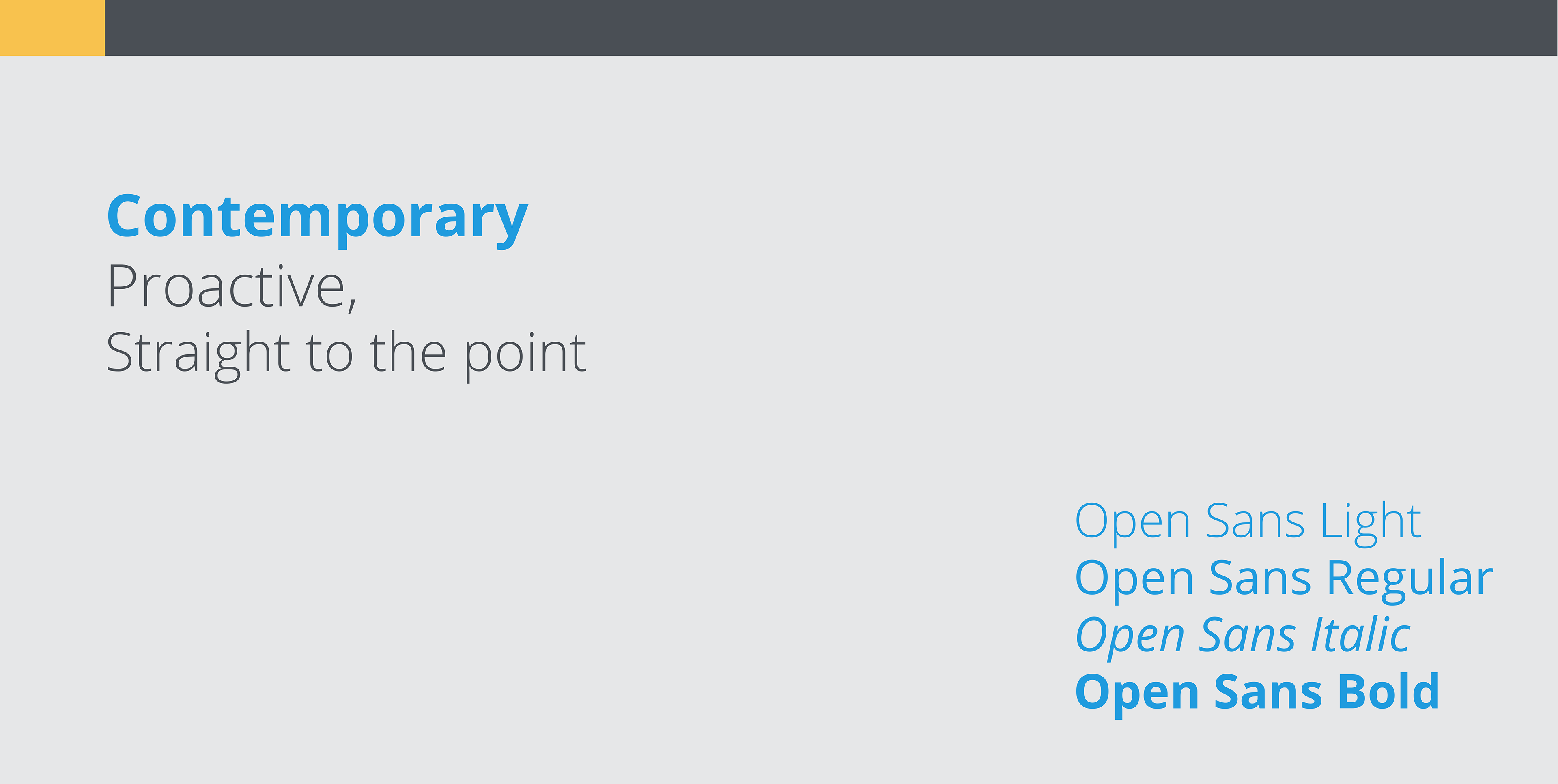

In the end of this creative process, I collaborated with the team and executives and they all agreed to combine the second Contemporary and third Bold concepts to create the user interface for the dashboard.
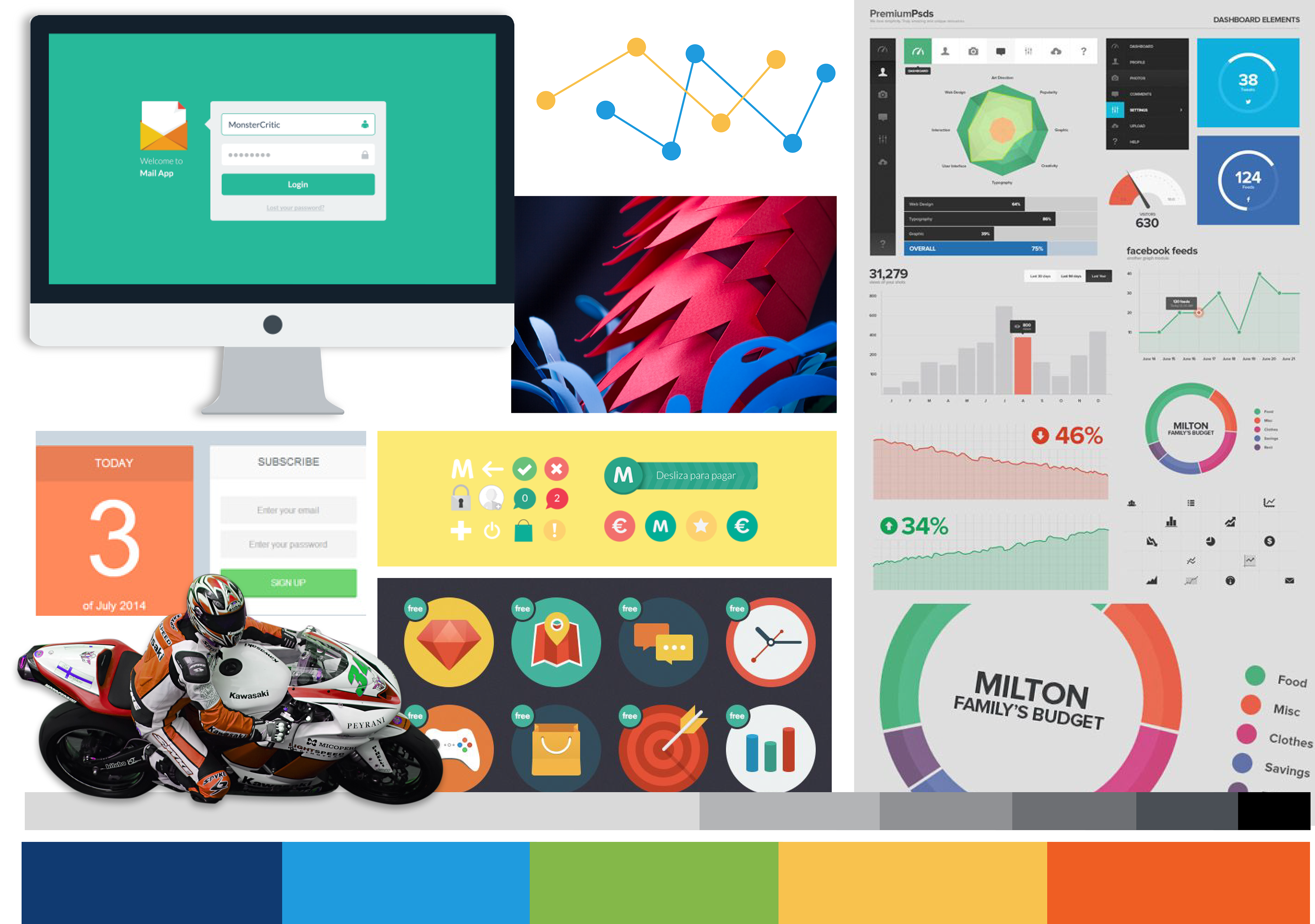


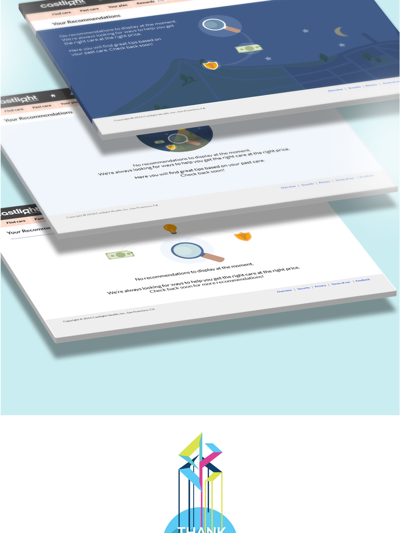
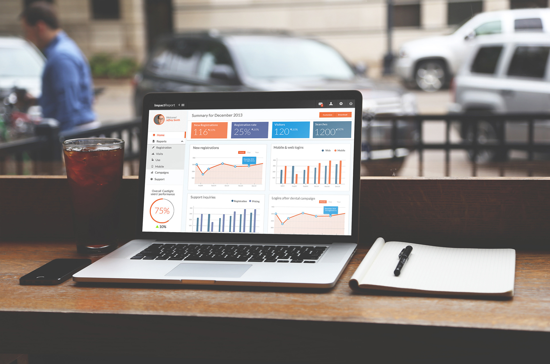
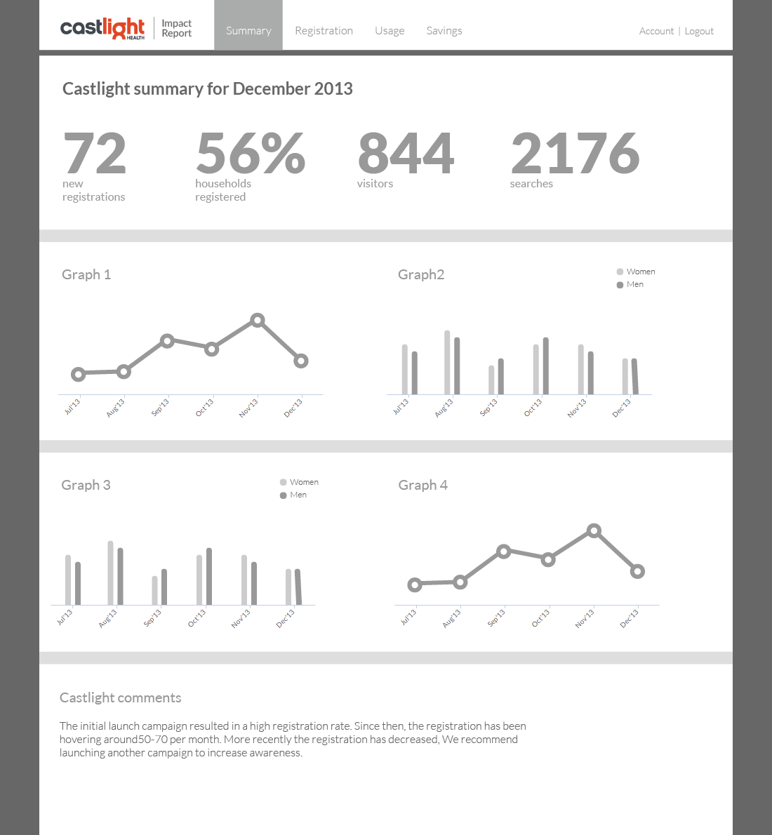
Data Visualization played a key role in this product. Users needed to see an activity summary, campaign status, reports on employee engagement and implementation status of cost-effective benefit solutions for the company, as well as other important data which was in the majority, activity overtime or comparison between 2 or more items.
Bar graphs and line charts are proven to convey this kind of information the best. In my initial mockups I included arrows that pointed up or down compared to last month's performance. Utilized vibrant colors and shapes for the home screen. During my tenure in this 5 month contract, I didn't get to design the report output tool but I worked on that kind of functionality, later at Wells Fargo. (See Desktop Deposit Reporting project).


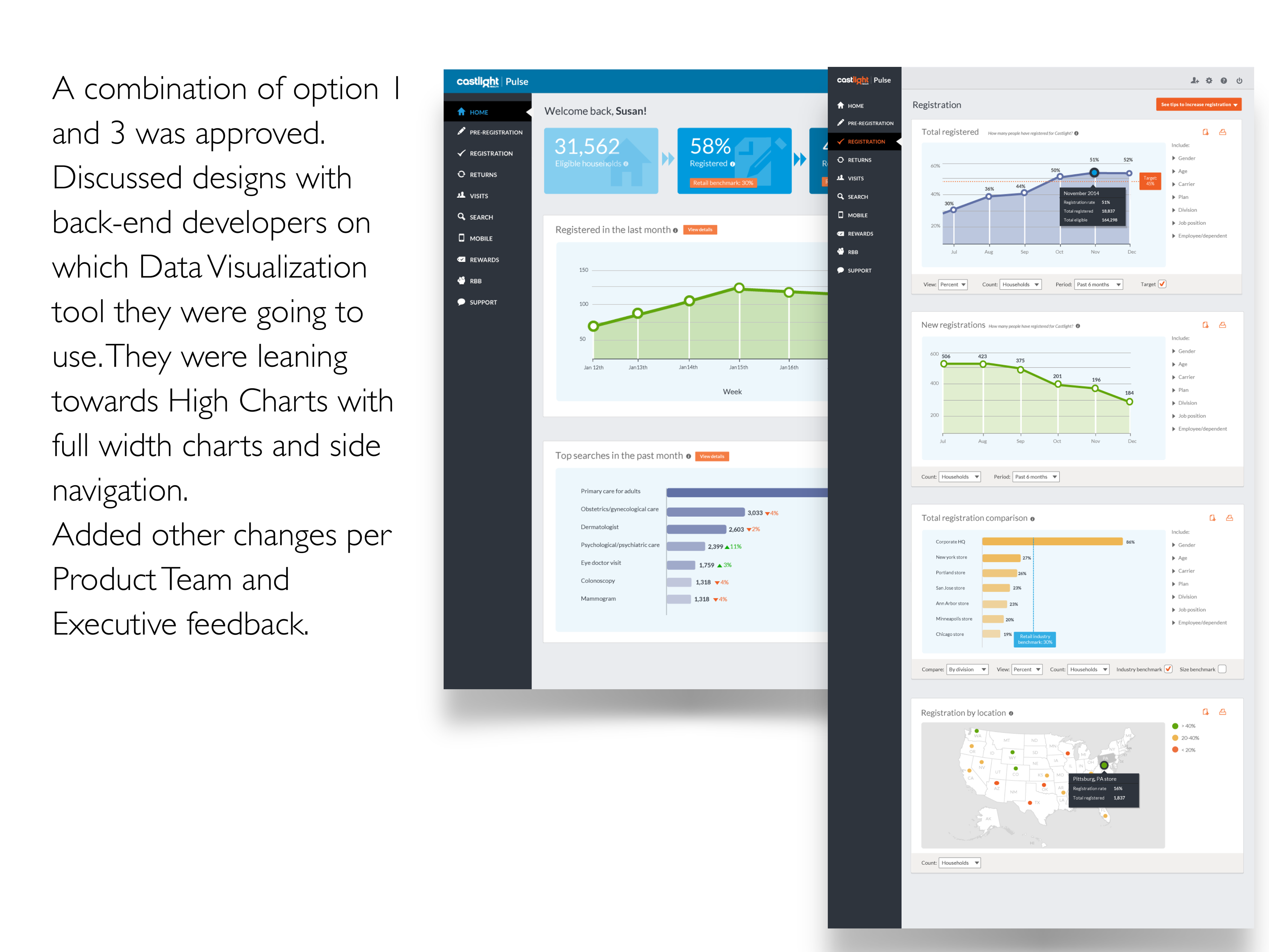
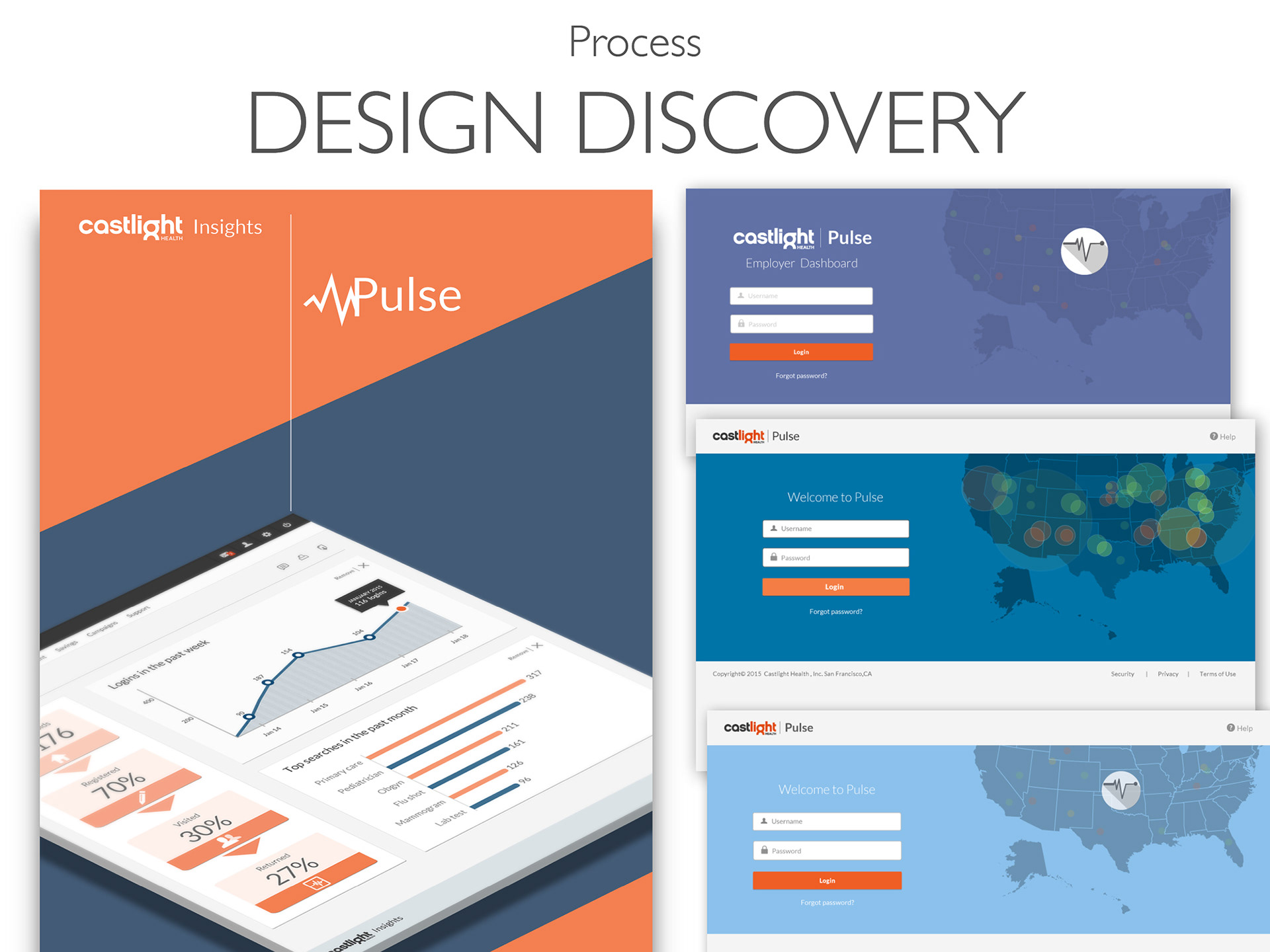
The designs were iterated based on Back-End, Front-End technical constraints and Executive feedback. Elements such as map charts, profile avatar, couldn't be implemented at the time. The side navigation was still under discussion, to see if it could be developed, not collapsible at that time but would convert into a hamburger menu when hitting a smaller breakpoint in responsive web design.

Completed the project in it's initial Beta stage and handed off to the design team. (Deliverable shown on the left).