Overview
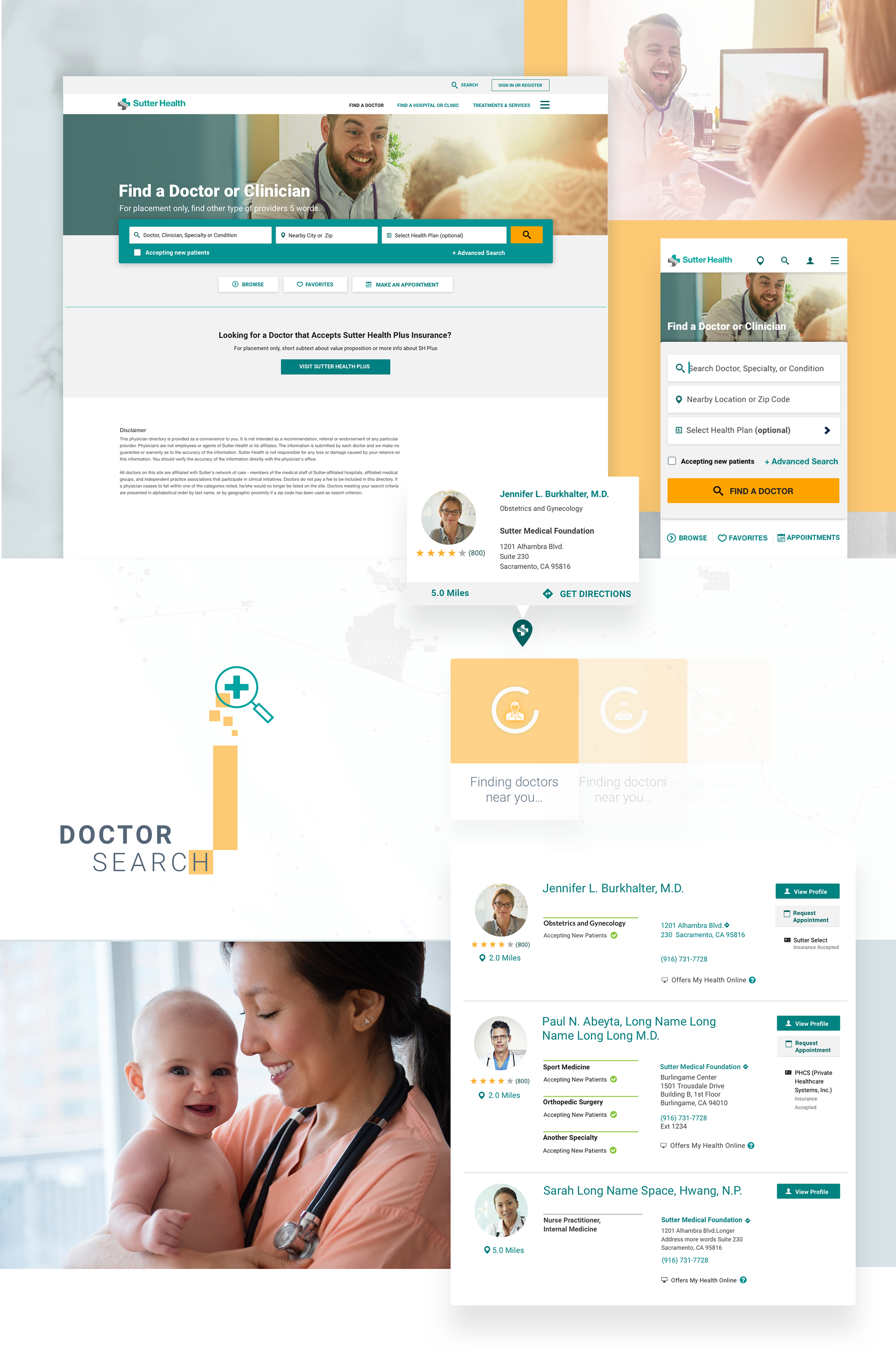
The doctor search functionality aims to provide visitors of sutterhealth.org a way to search for a doctor near their location, offering the specialty of their choice. Problems were found were users couldn't find a doctor in most cases. Patient feedback was gathered through online surveys and the organization decided to address the problem quickly.
Business Problem
1. The organization needed to gather new patients and retain existing patients. If patients cannot find a provider of their choice, revenue suffers and decreases. Competitors offer comprehensive doctor search so the organization's goal was to keep up and surpass the competition.
2. Current patient advocacy: The organization's reputation needed improvement, since it was suffering mainly because patient's weren't able to connect with a doctor promptly. With patient retention, revenue remains stable and increases overtime.
User's Problem
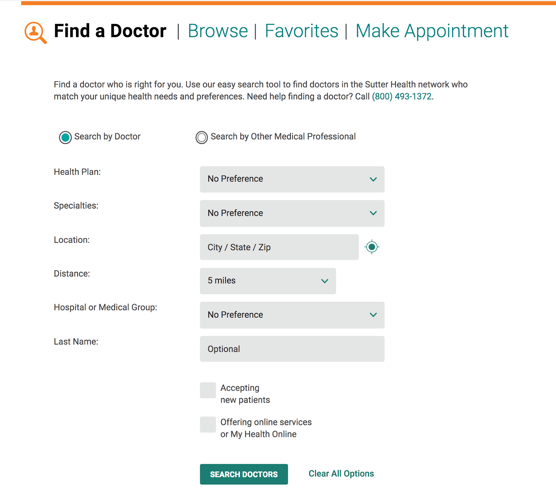
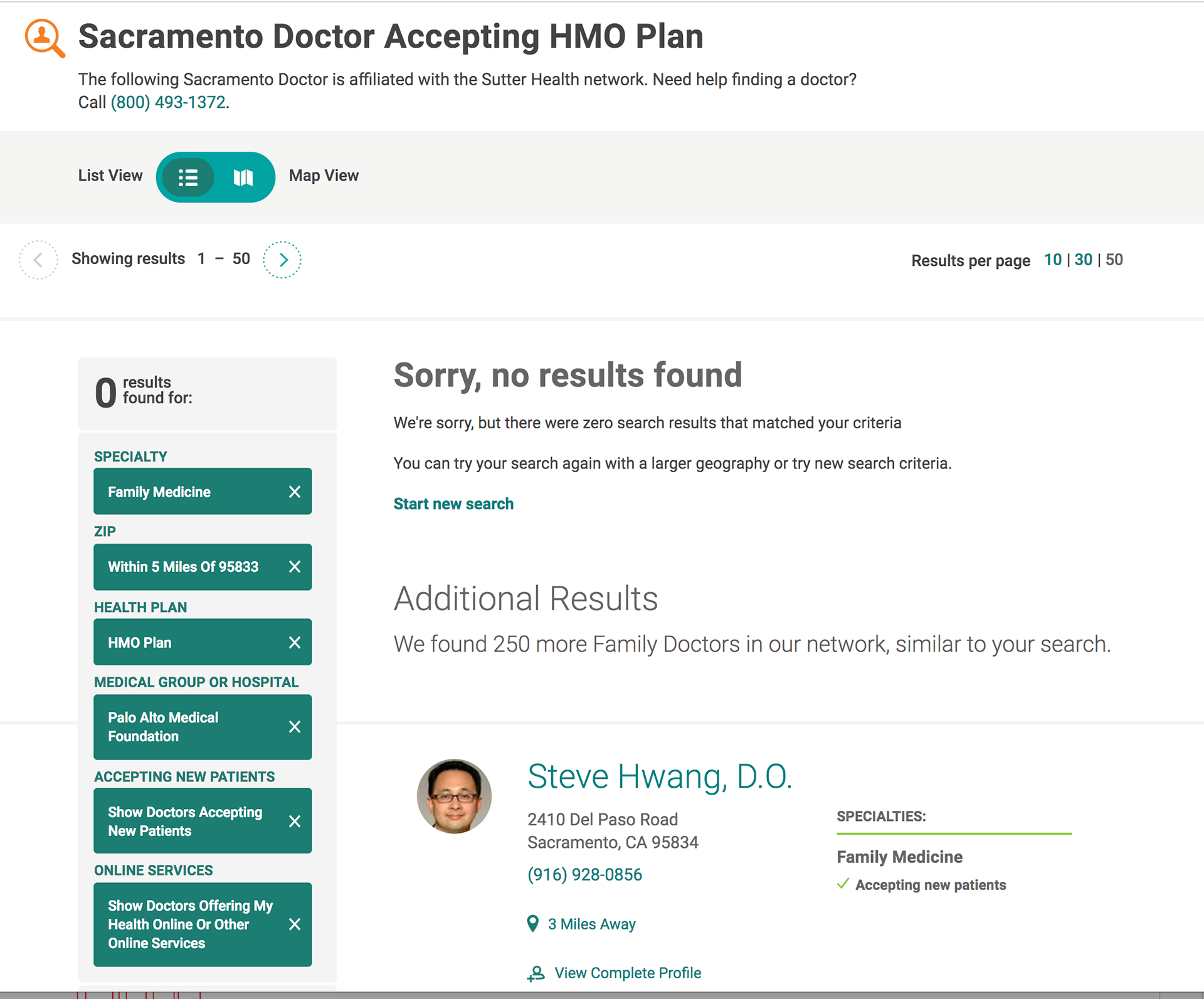
1. The patient couldn't find a doctor of their choice and most of the times was encountered with a "No results found" message
2. The patient had difficulty entering all the information in the search form. Even though they entered all the information, there were still no results or doctors were not around their area
3. Difficulty on filtering the search results. No signifiers or contextual cues were offered as to why results were not found.
4. Users couldn't find a way to start a new search and view new results in place. Many design conventions were not available to match users' mental model
My Challenge
1. Low budget reserved for usability testing. In-person usability testing was not available so came up with alternative solutions to test. Created low fidelity prototypes to test and iterate quickly.
2. Short timeline and aggressive deadlines. I could meet these and tackle each problem but it was challenging to not have more data during the design phase.
3. Limited chance to take risks. Since there wasn't time or budget for usability testing, I followed a safe approach applying standard search design conventions. On mobile, I could break the mold and be a little more creative.
4. Sole contributor in the project but had the chance to review with peers and developers as well as QA testers.
Process
Research, Planning and Goals
I was in charge of planning a test script that was set up in an online self-guided Think-Out Loud Usability Test. We decided to test the current experience first to benchmark against concept design usability testing.
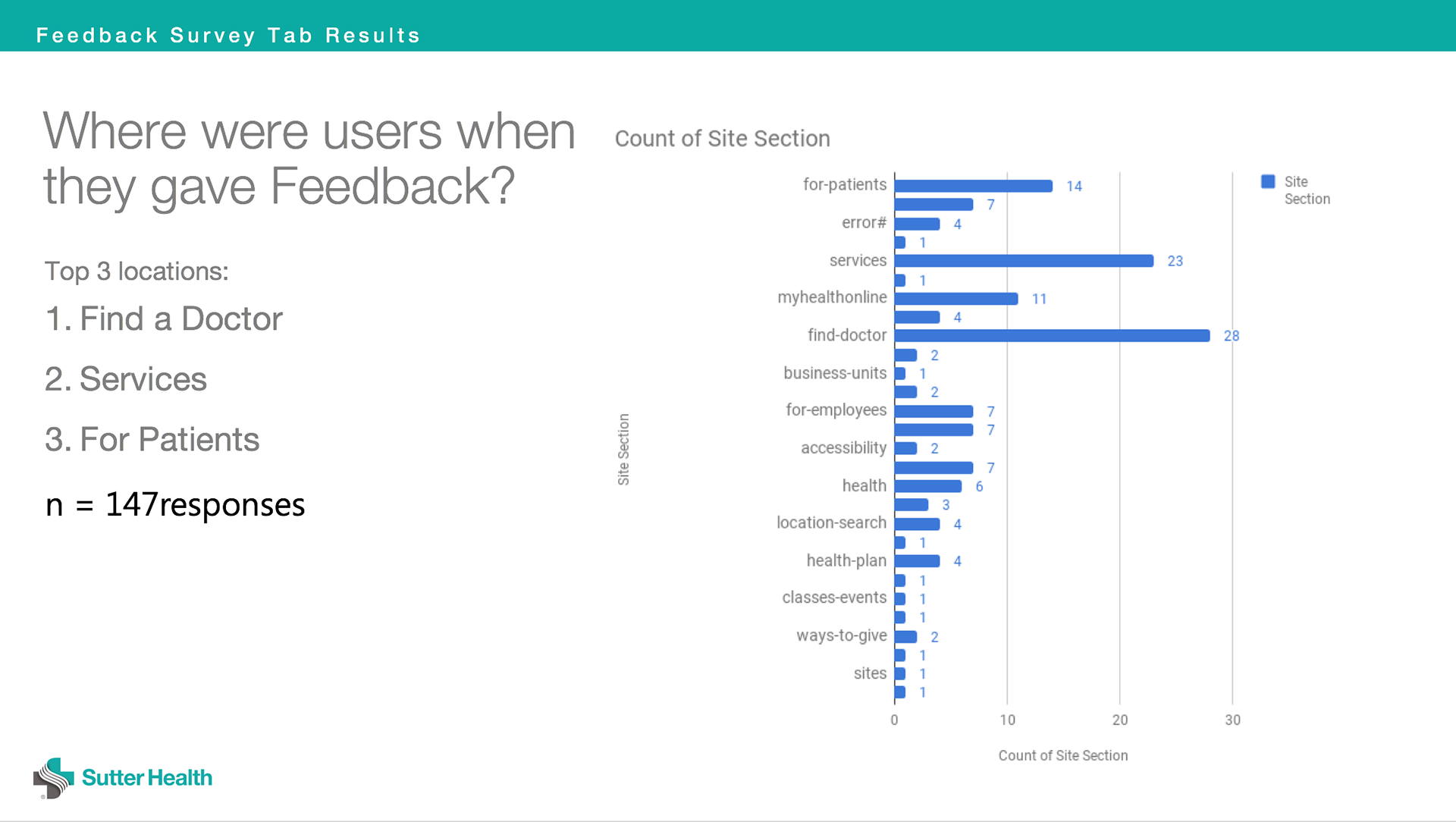
Based on the patient feedback from an online survey available on the website, I took a detailed look at the qualitative data as well as the quantitative data. Most issues found related to site navigation and architecture, problems finding a doctor, problems logging in. Stakeholders decided to solve the doctor search problem first.
Below is the data that showed where patients were in the website when they submitted their feedback.
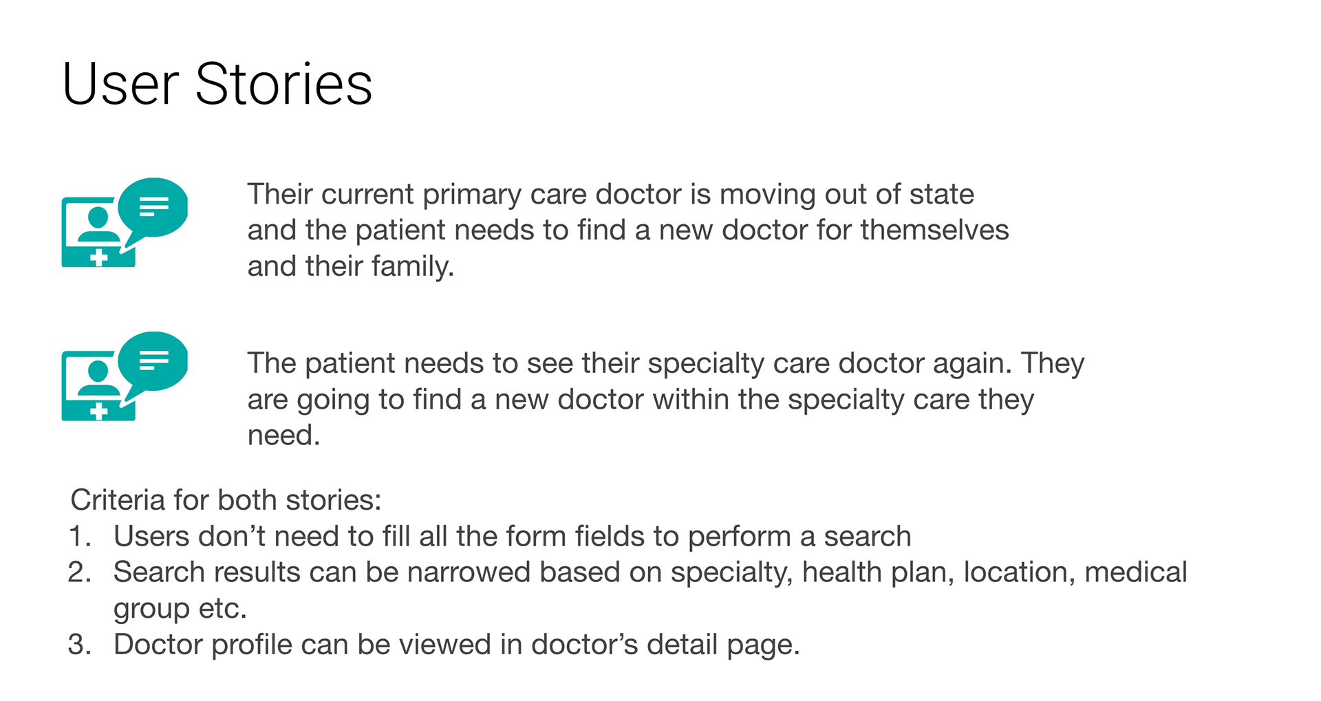
Use Cases
1. You recently relocated and need to find a primary care doctor for your family
2. Choose a specialty and find a doctor offering that specialty.
For the purpose of this test we had simple scenarios supporting 2 use cases but these could be more complex like being referred by a doctor to a specialist and searching that specific specialist, appointment scheduling, etc.
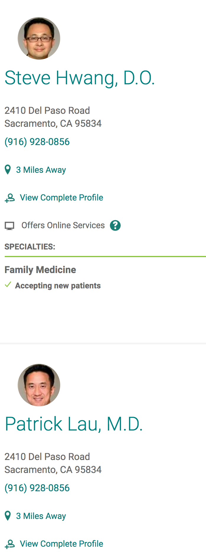
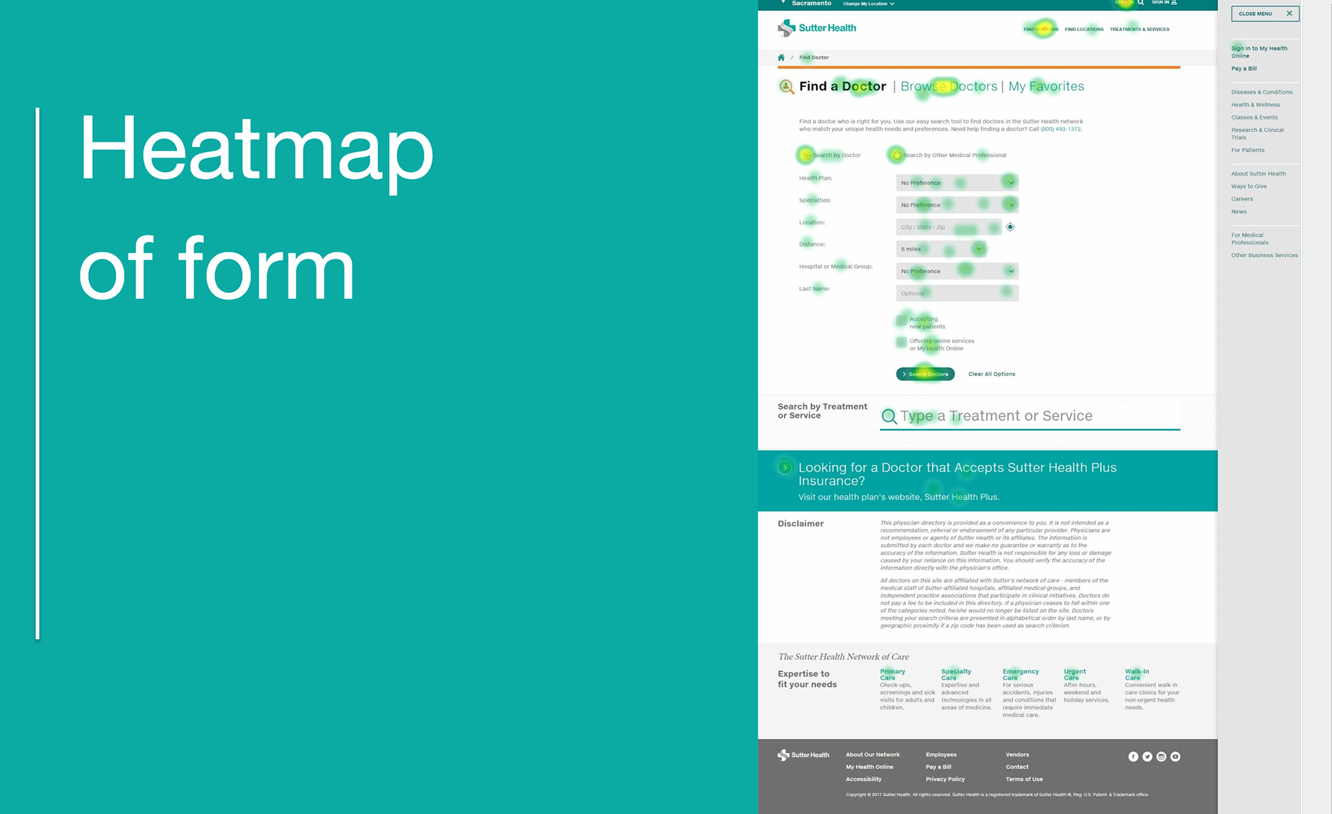
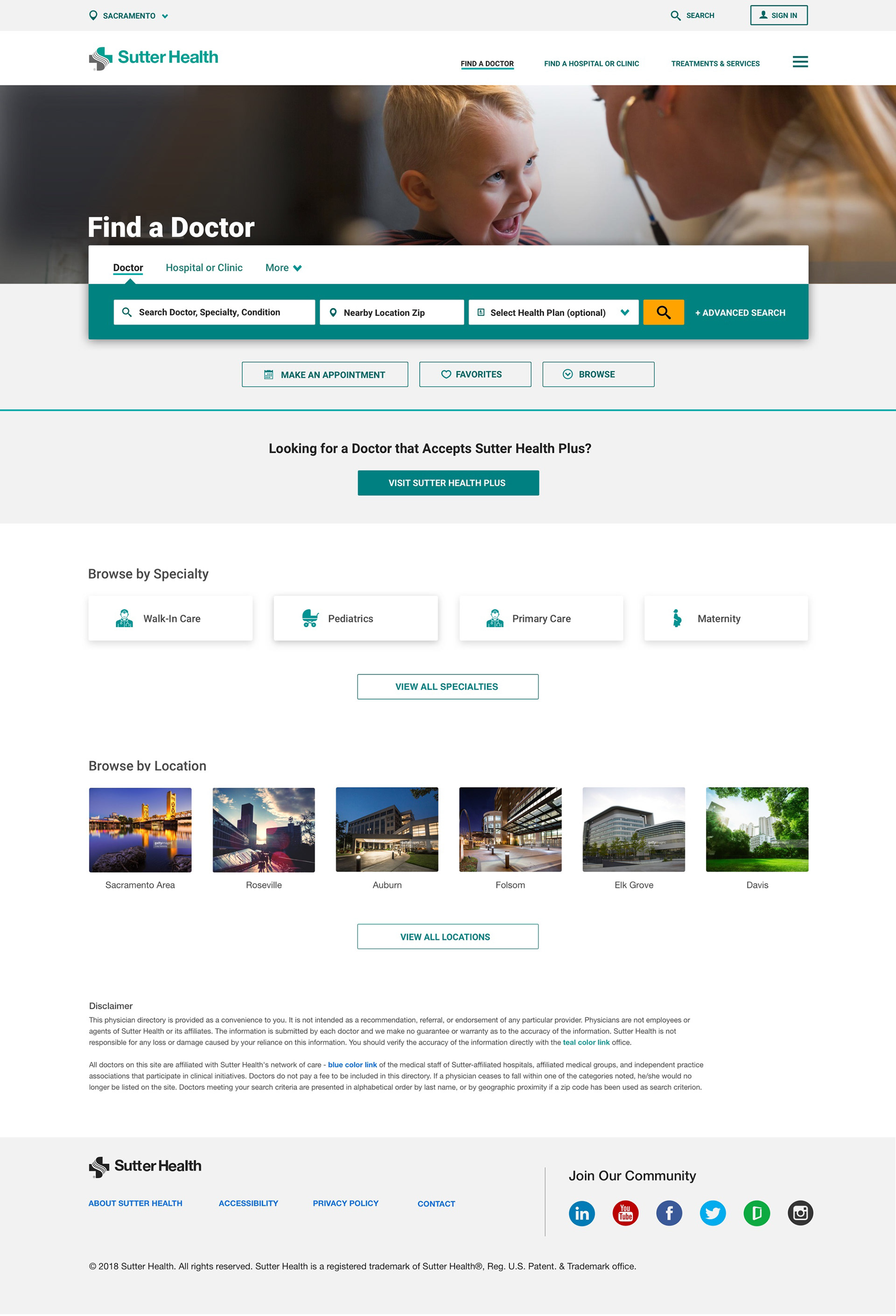
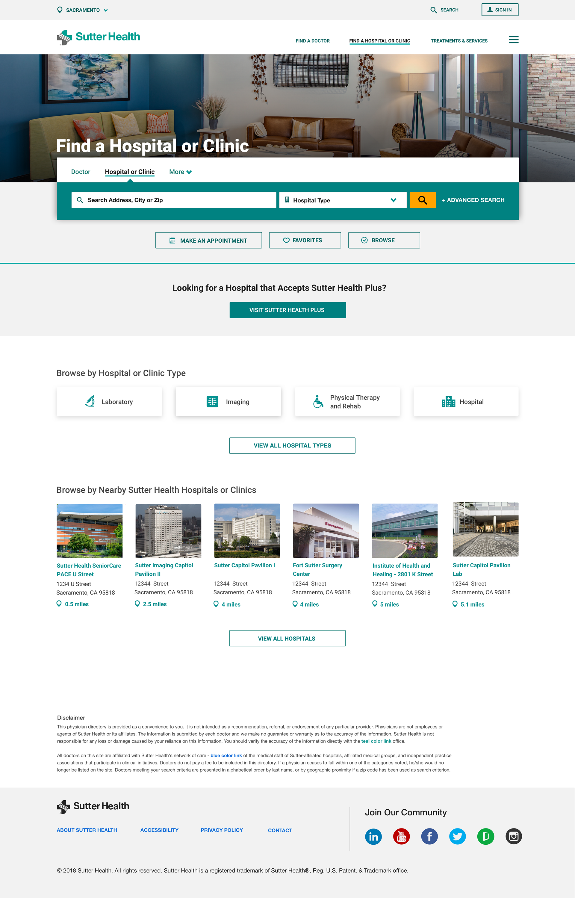
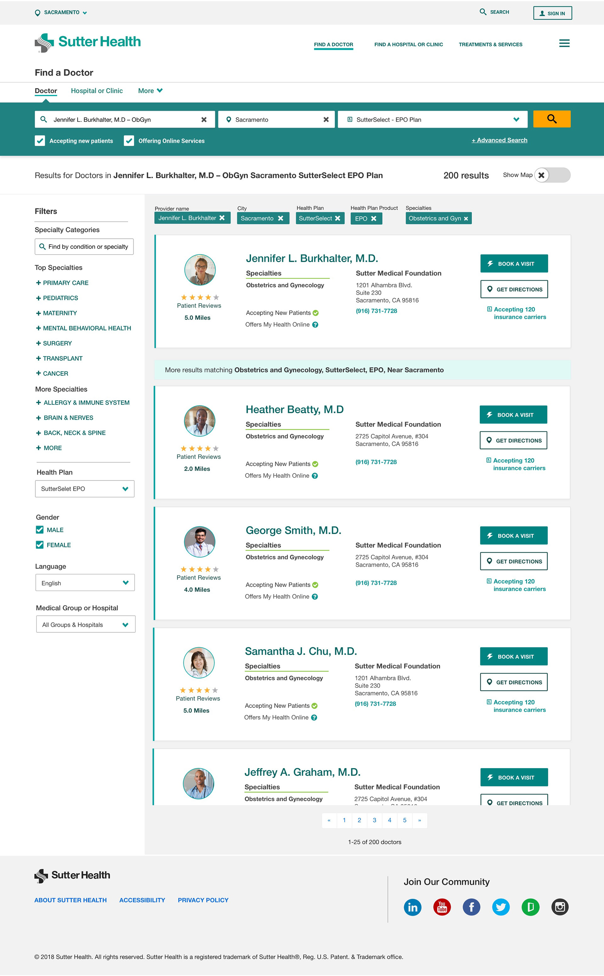
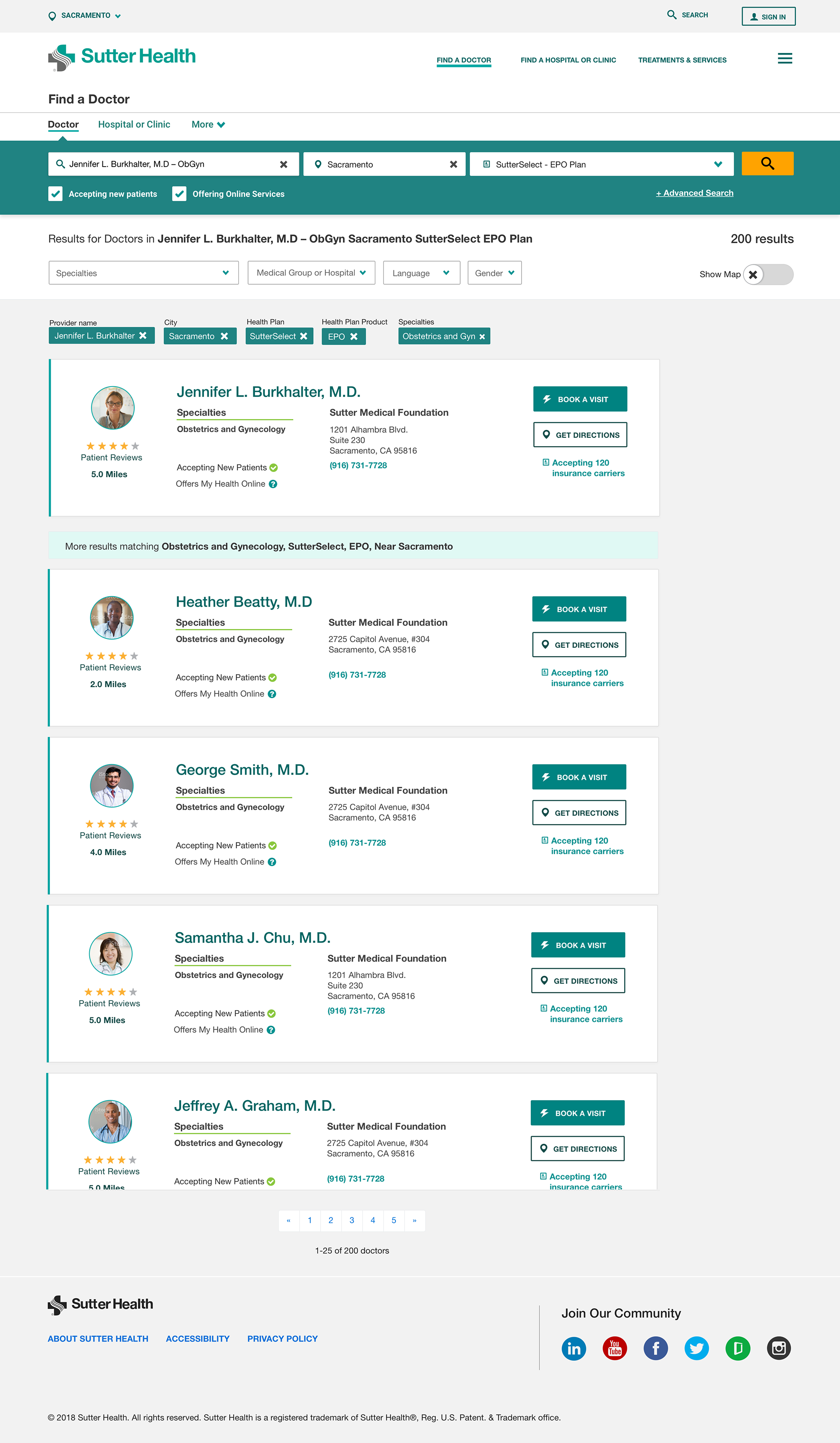
Previous experience screenshots below:
We did a Remote Think-Out-Loud Usability Testing with 15 participants. I reviewed all the videos, and annotated all the aspects I found that could support my ideas to improve the doctor search experience. The data showed that almost half of the participants didn't think the experience was easy.
Previous experience initial Think-Out-Loud usability testing results.
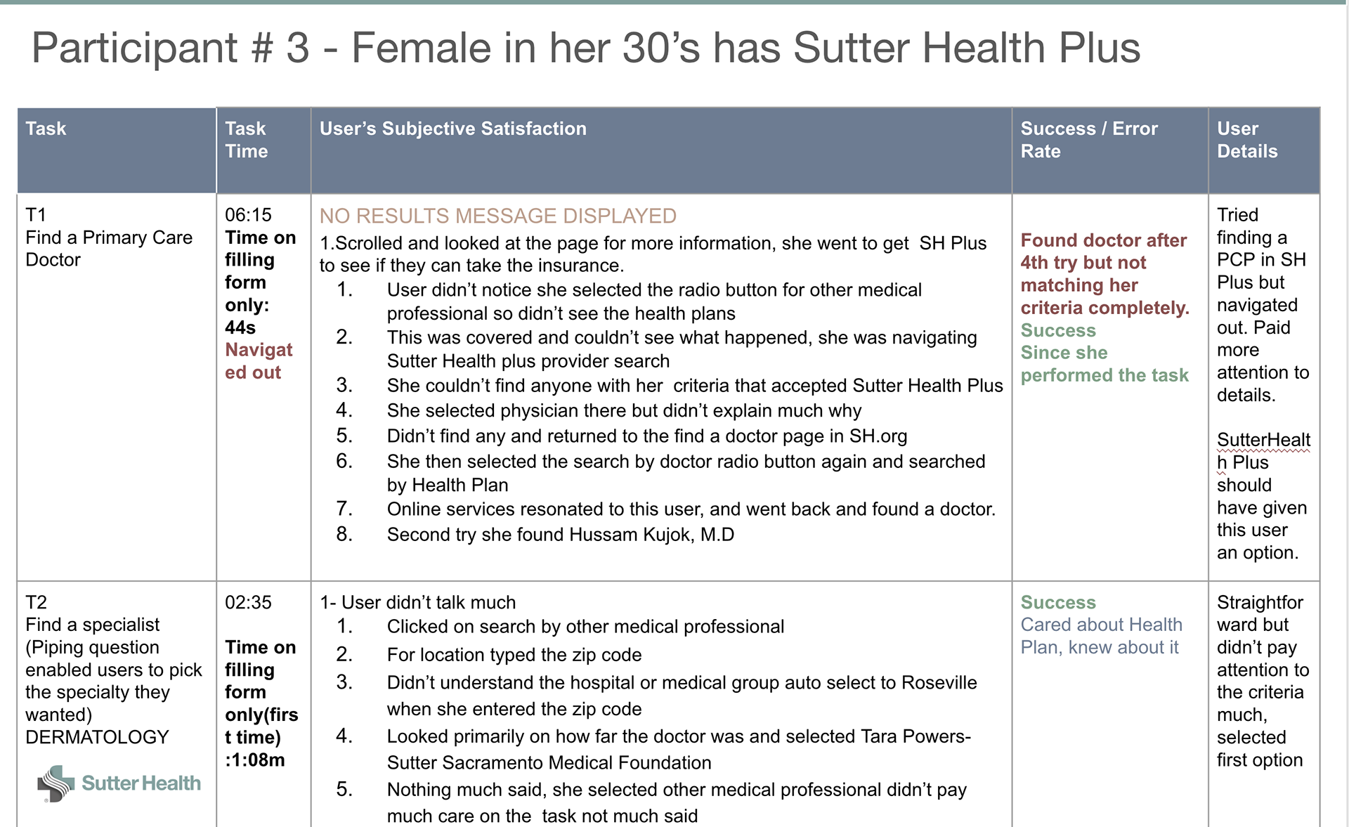
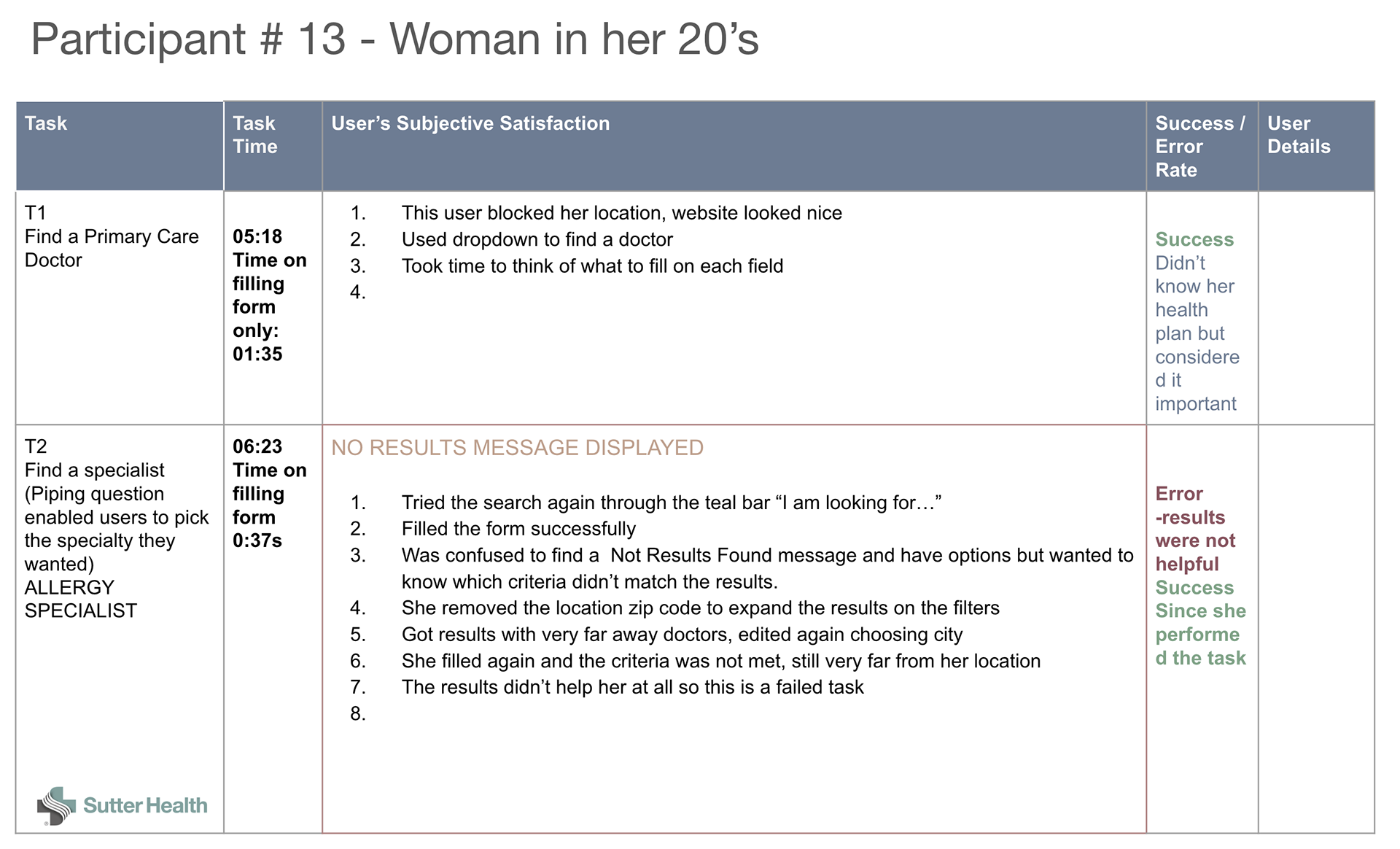
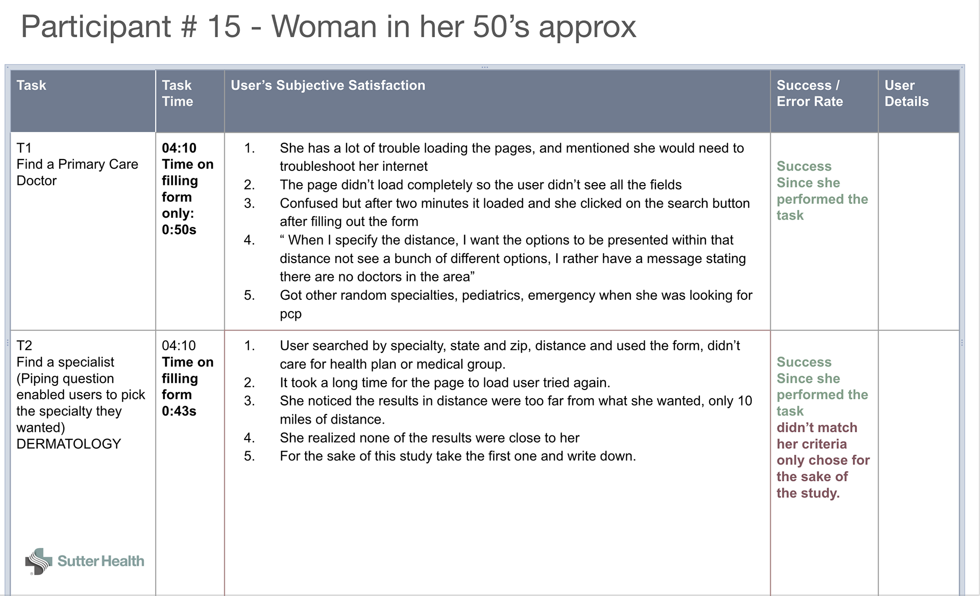
Common behaviors across all users
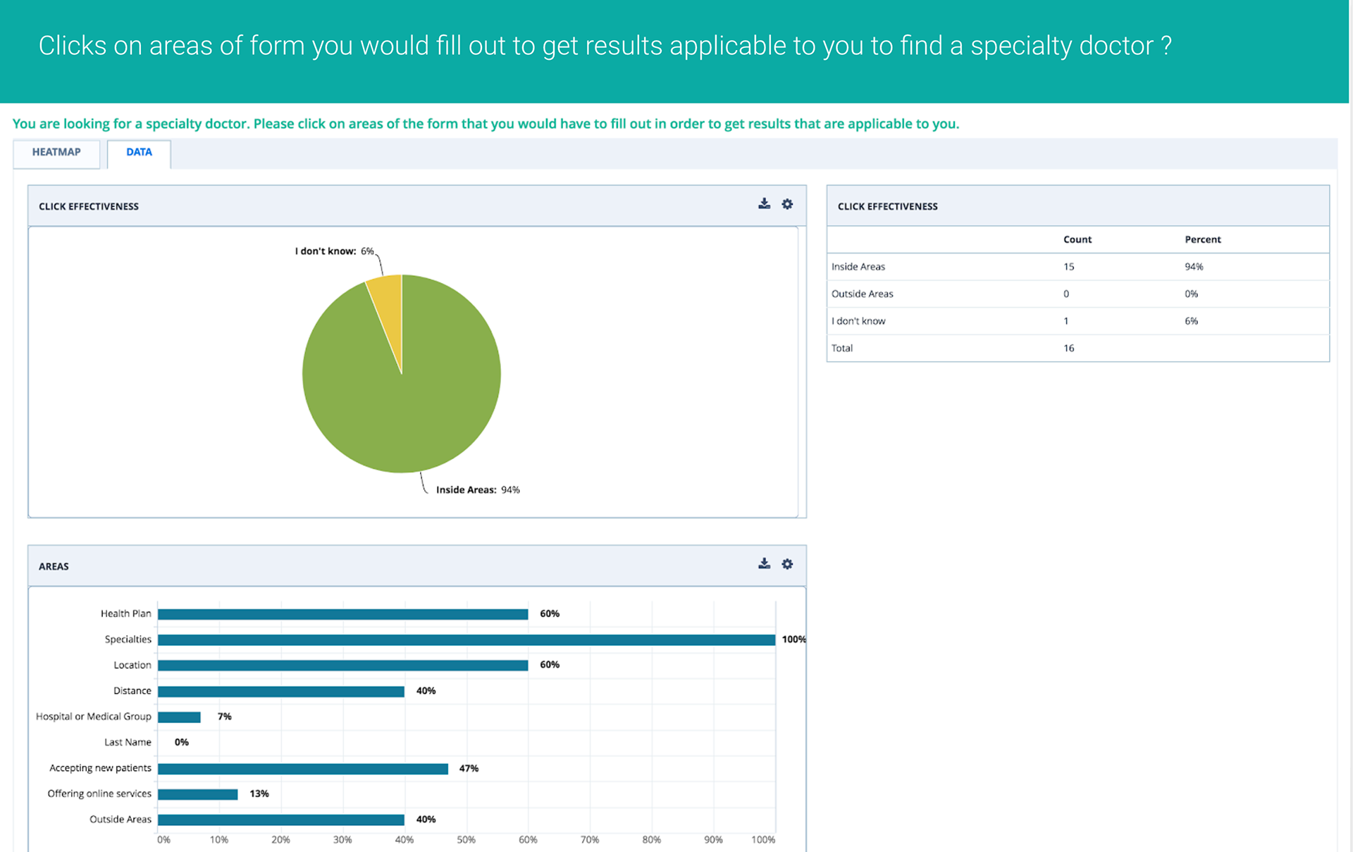
1. Type on the Specialty form field first then location, then distance and then go up again and type their health plan if they know it. Most overlooked the select product drop down.2. If No Results Found, ask why the suggested results matched their criteria, and point out which filter was making them not find results.
3. Click on filters and edit the distance tag, removing the distance to see if options come up.
4. To start a new search click on Start New Search link if no results found.
5. No one used the Last Name form field.
6. Only 1 user knew their medical group CPMC.
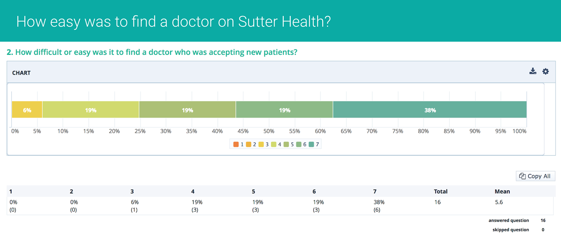
7. 6 out of 16 users knew their health plan
8. 8 out of 16 users got a Not Found Search Result message
9. 1 out of 16 participants had problems loading the site
Since many filters were applied before reaching the search results, the consequence was in most cases, not found results.
Recommendations and Opportunities found:
1. Improve filter functionality and interaction.
Users liked this feature but this was still not the best interaction for them. Others didn’t notice so tried again to fill the form to find a doctor.
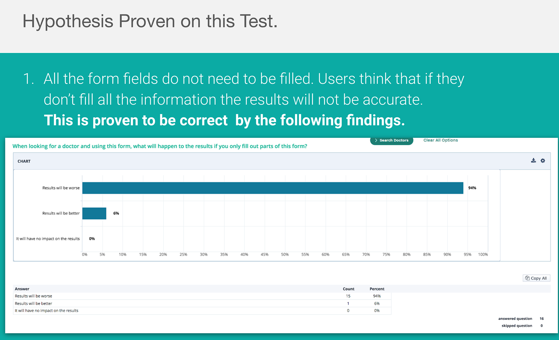
2.Reduce form fields on find a doctor. Users felt they had to fill all of them to get better results, and were confused when results were not found.
3. Find out which ones are the top 2 fields relevant to them to simplify search. They are spending an average of 89s to fill out the entire search form. Filling out a search field should take fewer seconds of their time.
4. Show distance in miles in search results page for all doctors.
5. Show keywords that didn’t or did match their criteria when results are not found but there are suggested results.
6. Include Health Plan in the top 3 fields before starting search.
During this test and other surveys it was found that patients wanted to first search by specialty, closer location and filter by best ratings. 40% of participants knew their health plan so we kept that selection and simplified the form. Other priority information for users: Doctor accepts new patients, gender, board certified.
UX Design Work
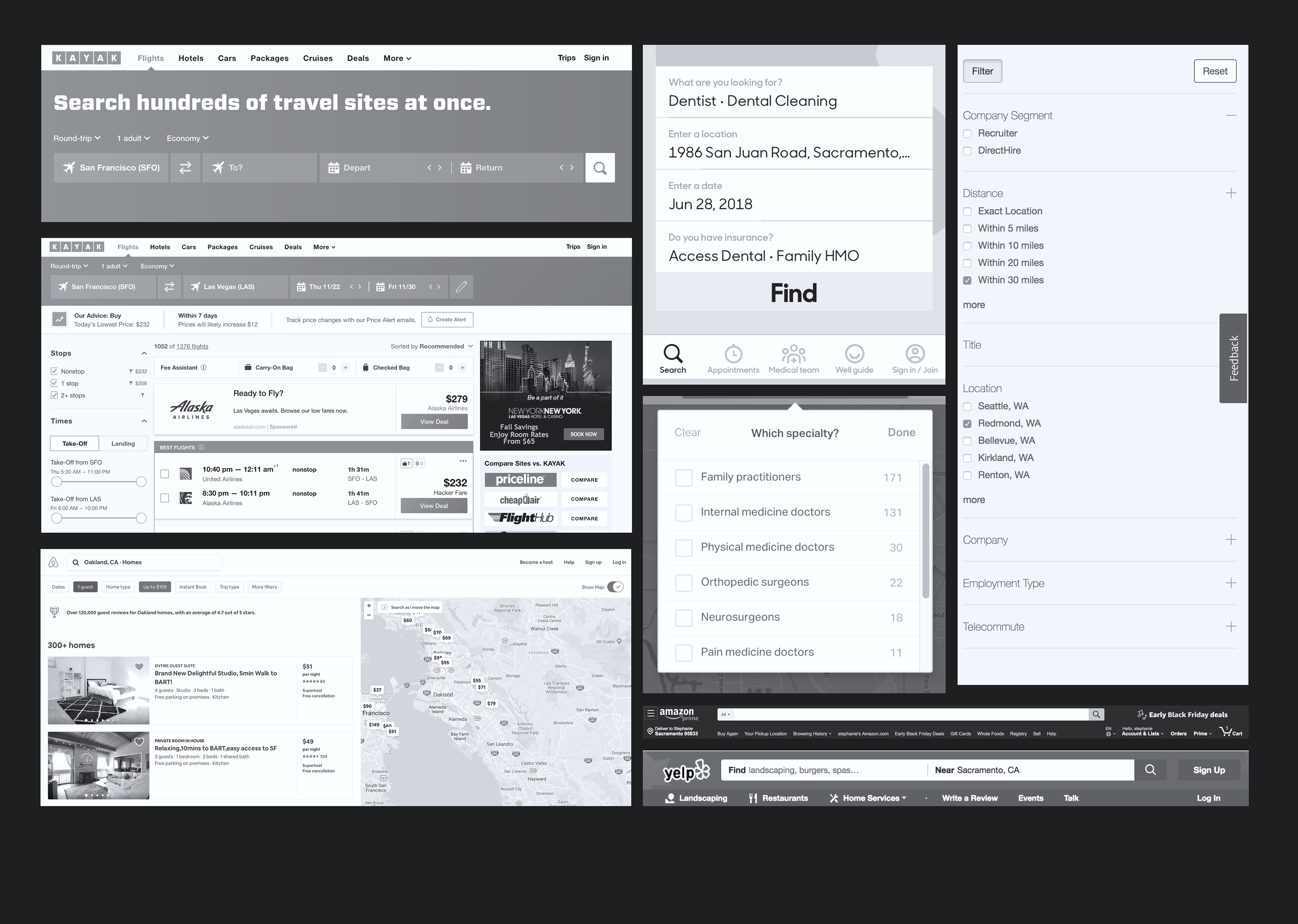
User Flows and Competitive Analysis
Sketches and low fidelity wireframes- whiteboard sketch, pencil sketch, low fidelity black and white wires-
Concept Design Testing – Desktop and Mobile show tab and dropdown approaches
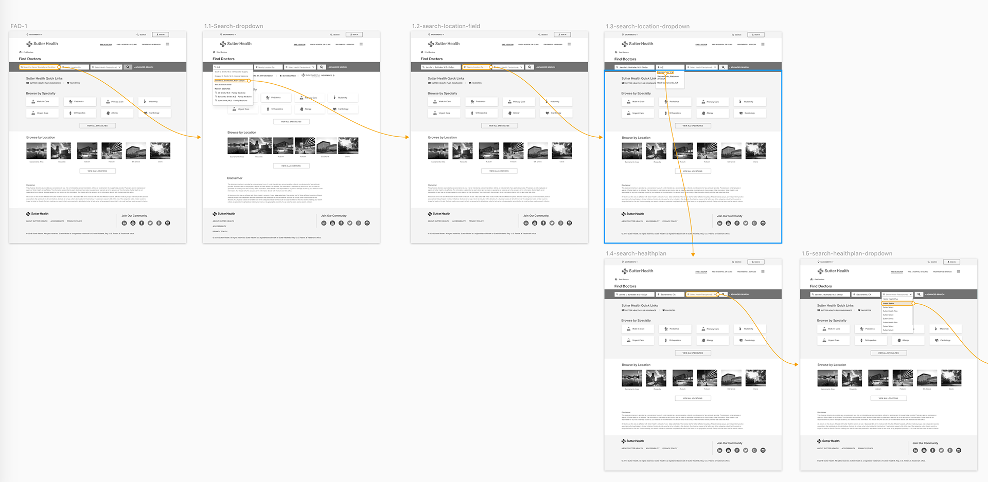
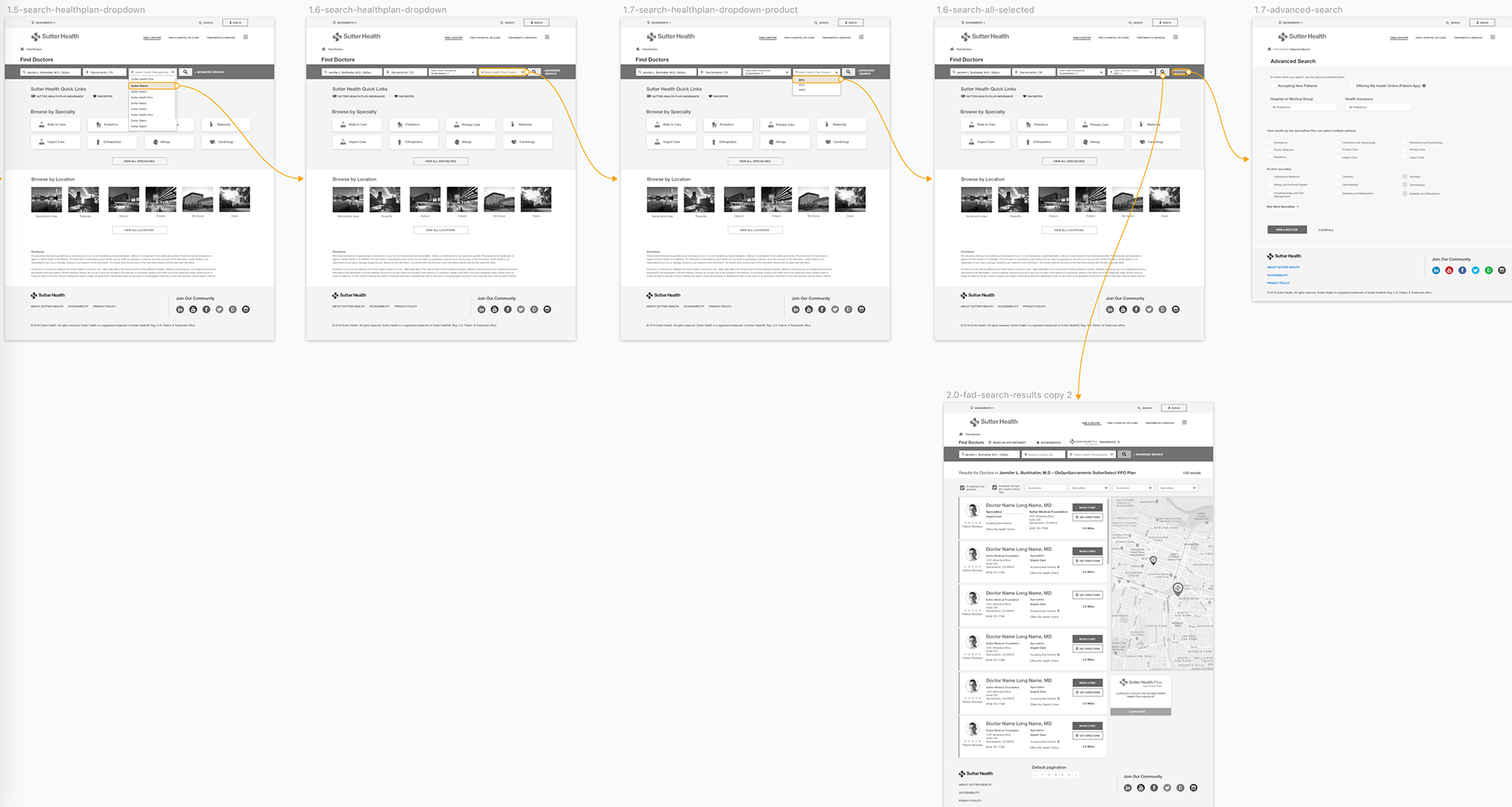
After sketching, I mocked up a desktop user flow. When the flow was reviewed and approved I proposed to do a screenshot click test to ensure the layouts, functionality and purpose made sense to the user. The plan was to tackle both Find a Doctor and Find a Location together but due to budget and resource constraints it was reduce to doctor search to start.
Think-Out-Loud Mobile Prototype Testing-
Video of invision prototype
Findings in testing that informed design decisions
On mobile, I worked quickly on a prototype that we tested remotely with 10 participants.
1. Users were missing the 2 checkboxes "Accepting new patients" and "Offering My Health Online". –I decided to go with a toggle "switch" style component to make these larger on the screen and more comfortable to touch and toggle switch.
2. Users were confusing the "Additional Results" message with an error– Removed the styling and kept clean and simple.
And more learnings like this informed both desktop and mobile designs. I simplified the layouts, interactions and screens.
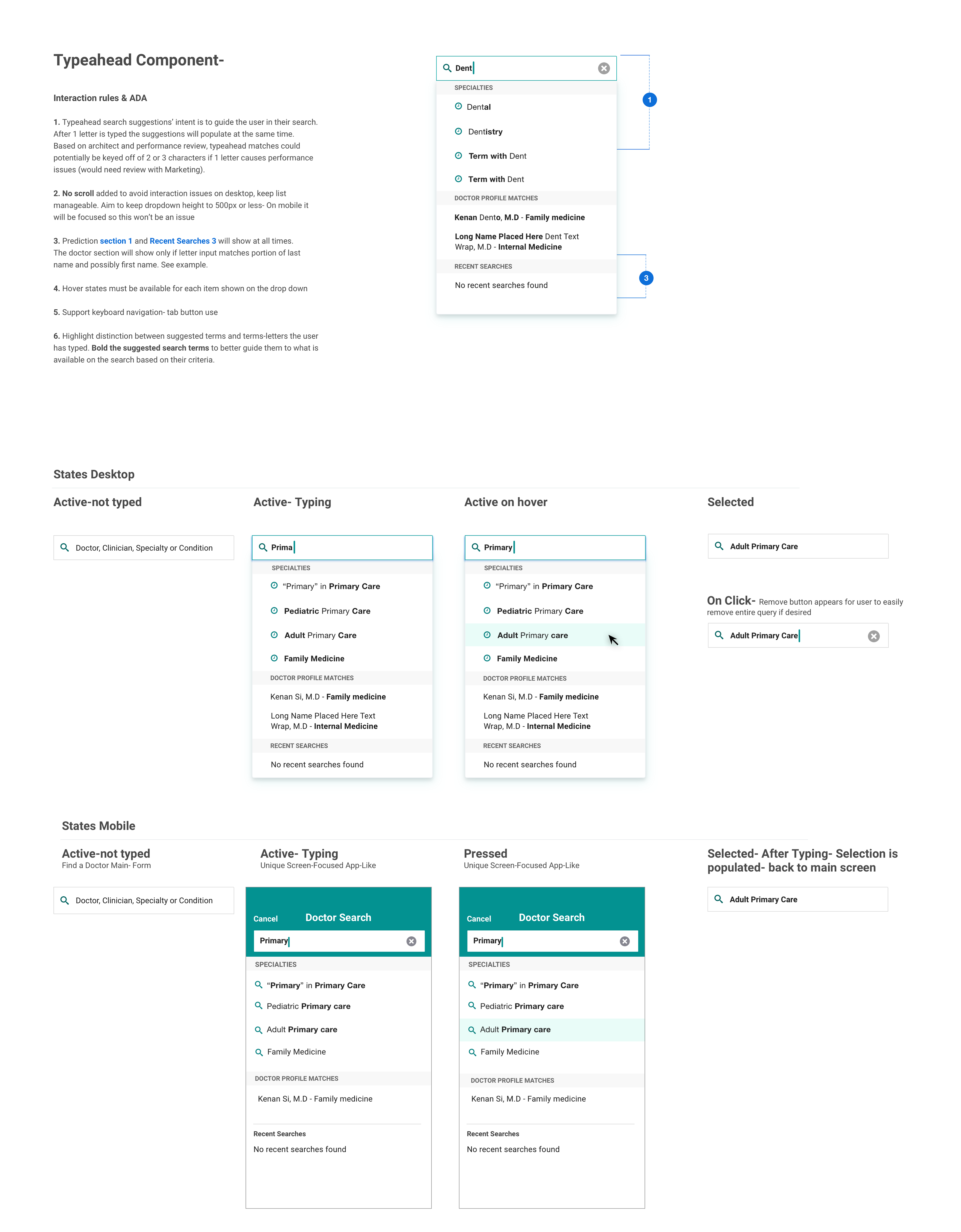
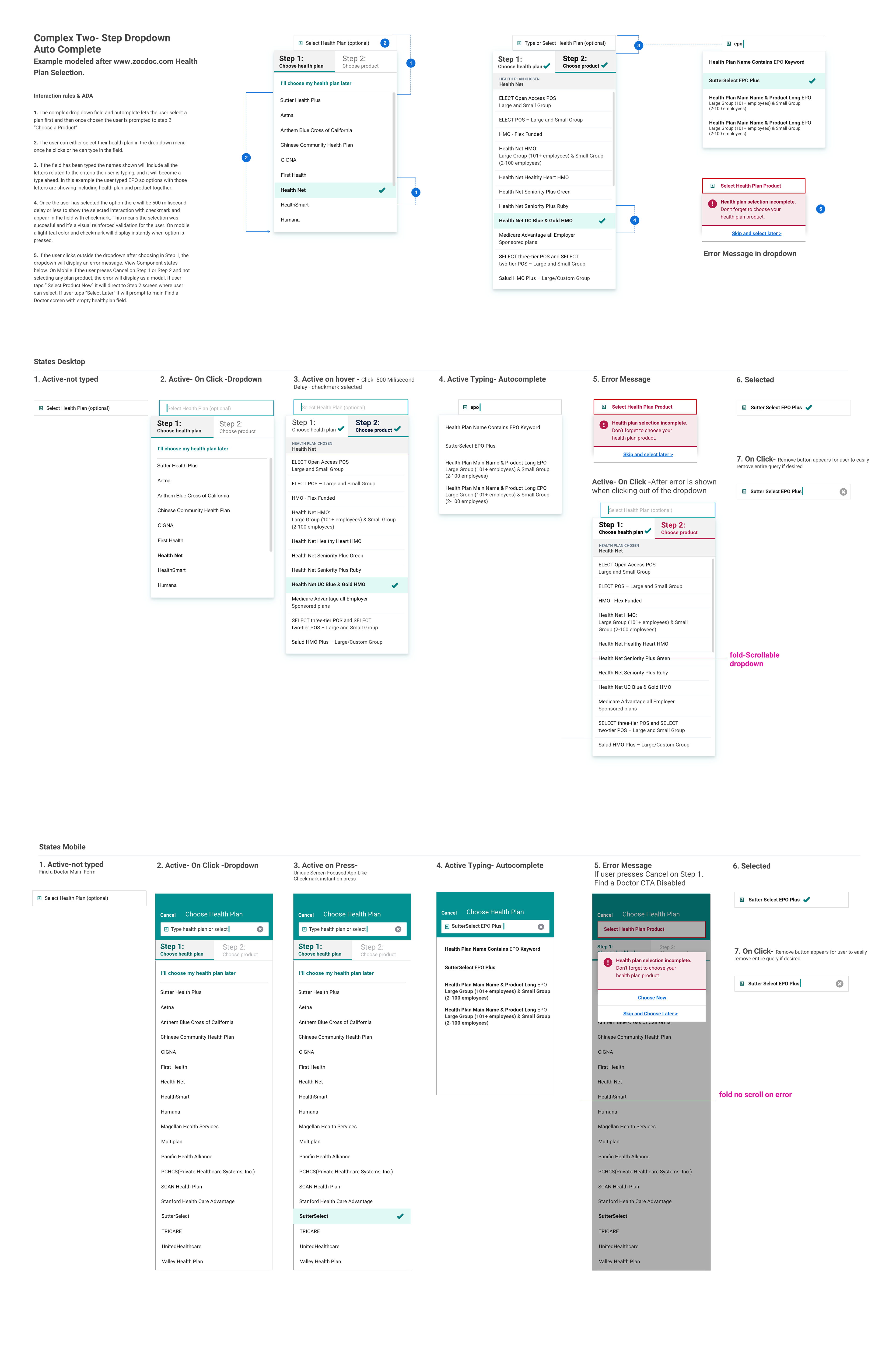
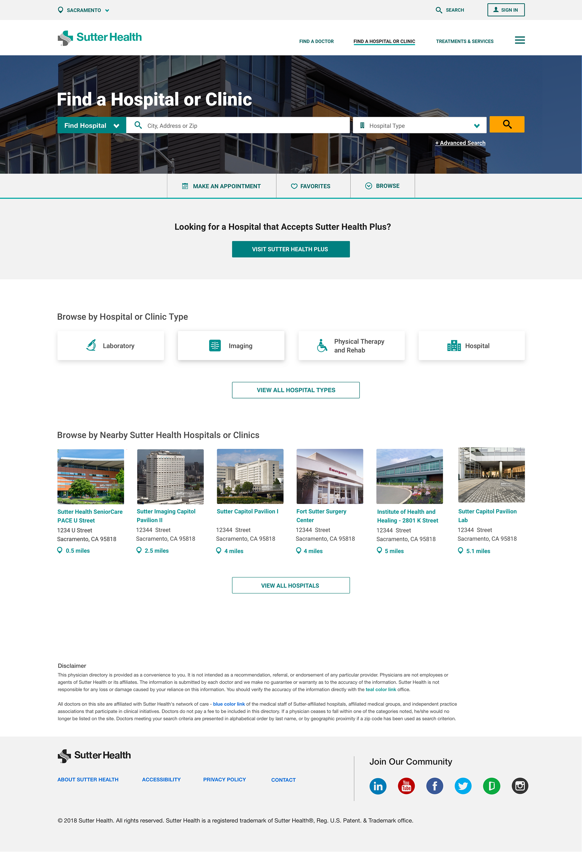
Final UX/UI Deliverables
Annotated Visuals for Development