Business Problem
Sutter Health planned a restructuring of the sign on flow that would integrate into a Single Sign-On where users can sign into their patient portal (My Health Online) from Sutterhealth.org as well as their My health Online desktop and mobile apps.
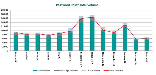
My Health Online operates with Epic technology so the back-end functionality took some time to develop. Once it rolled out, the call center was receiving 49% of calls related to password reset and login issues. Call center staff of 50 were answering calls left and right regarding both Login issues as well as password reset issues.
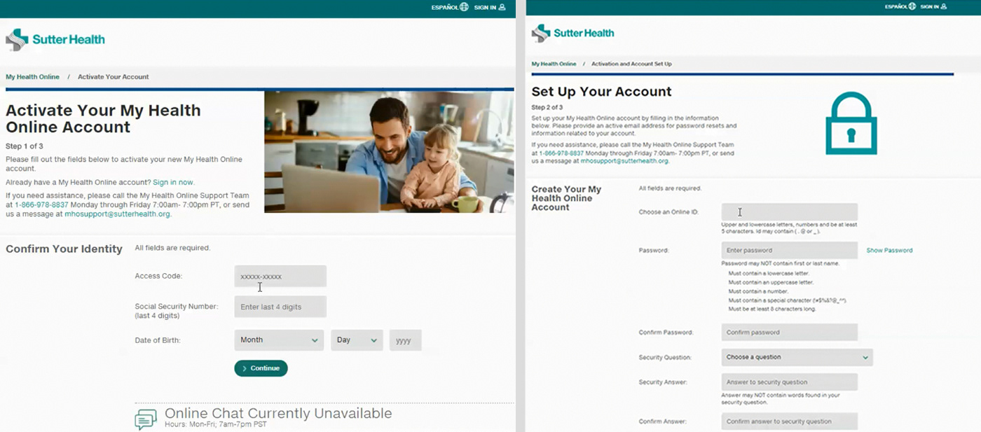
Before Password Reset Redesign
Users were having issues understanding how to reset their password as previously they were presented with a screen with a long form that didn’t follow standard conventions. Some were trying to respond to security questions but some letters were identified as matching the security answer. Other back-end issues were surfacing on the front-end that didn’t allow users go past the security questions. The flow didn't allow for other ways to set up or recover a password such as text message or email.
My Challenge
As the UX designer assigned to the project, worked within a cross-functional team to address the issue. The challenge was to find a solution standard enough to be easily understood by users, that could function on both desktop and mobile and still comply with the security question requirement but give users a step by step flow without overwhelming them.
With low budgets allocated to research, had to find a way to quantify and build empathy maps based on what patients were saying online through our feedback online tools.
Problem was time critical so needed to address it quickly.
Process
Research Activities
• Benchmark web analytics
• Review call volume charts as well as causes of customer frustration.
• Analyze patient satisfaction survey data online
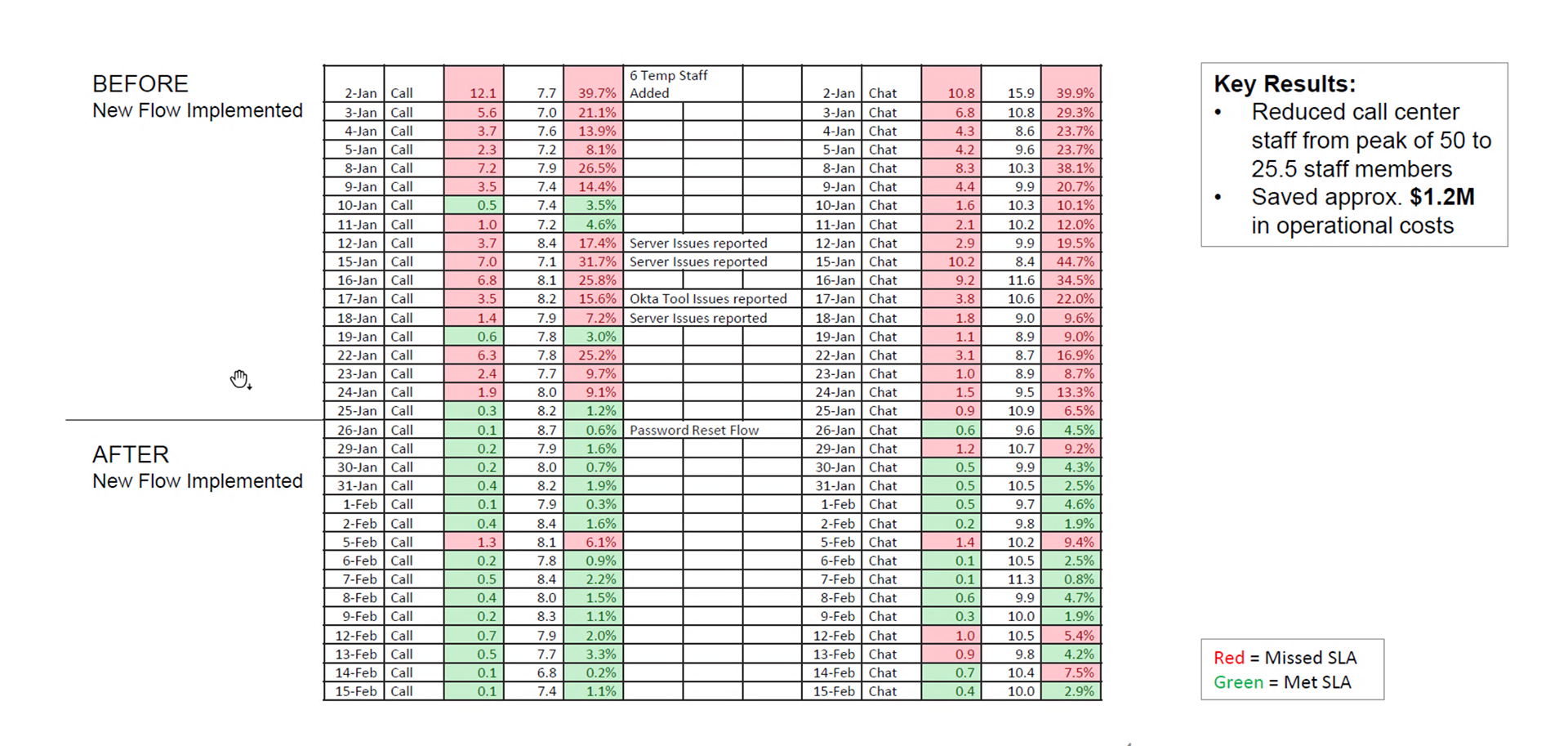
• Graph below shows the call volume before and after redesign roll-out in February 2018
UX Design Work
• Create use cases and user flows, whiteboard solutions with the team
• Build medium fidelity wireframes
• Create clickable prototype
• Deliver final design adhering to current SH.org look and feel
User Flows and Competitive Analysis
I worked with the team defining the user flow to solve the problem. The team and I did competitive analysis, on how different websites address Forgot Password or Password Reset Flows. We all concurred that the approach should be focused, targeted mindless clicks, and retrieve a code to be able to reset password. After an exhaustive analysis, I proposed a wizard approach, with a single screen showing a step by step process to retrieve the password.
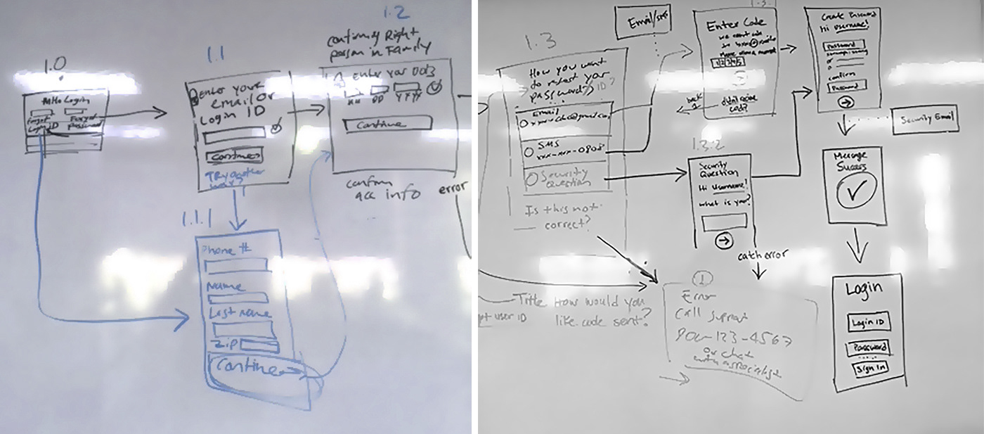
I started drafting the flow with the team from scratch. The new approach was completely different with a reason, with the goal to simplify and increase ease of use, without requiring the user to read so much, but just click and quickly reset their password.
Annotated wireframes, business and technical requirements
Proceeded to work on the digital versions of the wireframes and flows. The project was time sensitive so as the wireframes were created, they were also developed into a clickable prototype. I annotated most of the details via Sketch App and Invision so the development team and stakeholders had a better understanding of the approach proposed. Worked with analysts to match the design to the BRD and technical requirements. In Sutter, analysts or testers write the requirements during the design process or towards the end, so I was not required to annotate all the details.
Clickable prototype and responsiveness
The premise of the flow is to take the user into a focused state with one screen at the time, requesting initial information without any clutter, then have the user choose the way they want to confirm their account information. Receive a code via email, phone or security question.
Input Security Code , reset password and then all set to Login.
We allowed for the user to Login instantly once their password has been reset.
Email notifications take place to inform the user the change has been made, to ensure they have made the change as a security measure.
Development and Build
This flow was designed to be responsive and fluidly adjust from desktop to mobile screens.
Key Results
Reduced call center staff from peak of 50 to 25.5 staff members
Saved approx. $1.2M in operational costs
The password reset flow improved the patient experience greatly, saving Sutter Health an approximate amount of $1.2M in operational costs also increasing customer satisfaction.
